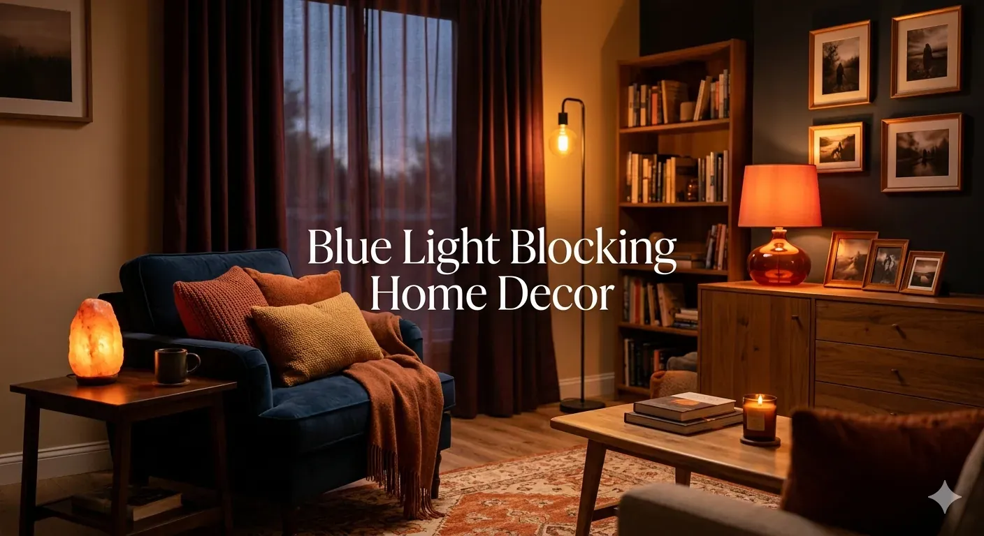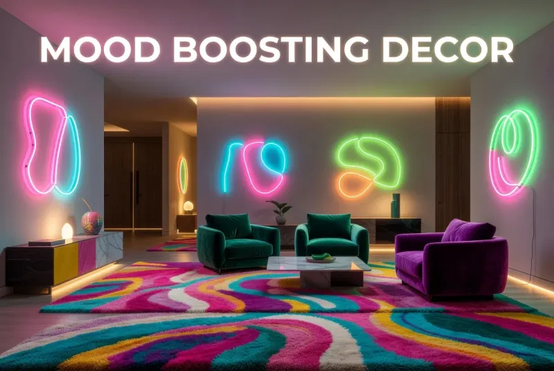
In a world where our homes have become our sanctuaries, workplaces, and sources of comfort, the movement toward "dopamine decor" has emerged as more than just a design trend, it's a wellness strategy. This vibrant approach to interior design harnesses the power of bright, bold colors to actively boost your mood, increase energy levels, and create spaces that genuinely make you feel happier. By understanding the science behind color psychology and applying it intentionally to your living spaces, you can transform your home into a source of daily joy and emotional support.
Dopamine decor represents a shift away from the minimalist, neutral-dominated interiors that have dominated design for the past decade. Instead of playing it safe with beige, gray, and white, this movement encourages embracing jewel tones, vivid primaries, unexpected color combinations, and playful patterns. The philosophy is simple: if certain colors can trigger the release of dopamine, the neurotransmitter associated with pleasure and reward, why not surround ourselves with those colors every day?
This comprehensive guide explores the science behind dopamine decor, reveals which colors have the most powerful mood-boosting effects, and provides practical strategies for incorporating bright colors into your home in ways that feel authentic and sustainable. Whether you're ready to paint entire rooms in bold hues or prefer to start with colorful accents, you'll discover how to use color as a tool for enhancing your mental wellbeing and creating a home that truly supports your happiness.
Understanding the Science of Dopamine and Color
To appreciate why dopamine decor works, we need to understand the neurological relationship between color perception and brain chemistry. When you see a color, your eyes send signals to your brain's hypothalamus, which influences hormone production and neurotransmitter release. Certain colors, particularly bright, saturated hues, can stimulate the production of dopamine, creating feelings of pleasure, motivation, and wellbeing.
Dopamine is often called the "feel-good" neurotransmitter, but its role extends beyond simple pleasure. It influences motivation, focus, energy levels, and even memory. When your environment triggers dopamine release, you're more likely to feel energized, optimistic, and engaged with your surroundings. This is why walking into a brightly colored room can instantly lift your spirits, while neutral, monochromatic spaces might feel calming but less invigorating.
Research in environmental psychology and color therapy has consistently shown that color affects mood, cognition, and behavior. A study published in the journal "Color Research and Application" found that bright colors can increase alertness and positive emotions, while another study in "Environmental Psychology" demonstrated that colorful environments can reduce stress and improve creative thinking. These findings provide scientific backing for what interior designers and color therapists have long understood intuitively.
The Neuroscience of Color Perception
Color perception isn't just visual, it's deeply connected to our emotional and physiological responses. Different wavelengths of light trigger different neural pathways, and our brains have evolved to associate certain colors with specific experiences and emotions. For example, bright yellows and oranges remind us of sunlight and warmth, triggering feelings of happiness and energy. Vibrant greens connect us to nature and growth, promoting feelings of balance and renewal.
The intensity and saturation of color matter significantly. Muted, desaturated versions of colors have subtler effects on mood, while highly saturated, bright colors create stronger neurological responses. This is why dopamine decor emphasizes bold, vivid hues rather than pastels or muted tones. The goal is to create a noticeable impact on your emotional state.
Individual Responses to Color
While there are general patterns in how people respond to different colors, individual reactions vary based on personal experiences, cultural background, and psychological associations. A color that energizes one person might overwhelm another. This is why successful dopamine decor requires understanding your own responses to color and customizing your approach accordingly.
Pay attention to how different colors make you feel. Do you feel energized by bright reds and oranges, or do they make you anxious? Does electric blue inspire creativity, or does it feel cold? Your personal color preferences and emotional responses should guide your decorating decisions, not just current trends or design rules.
Colors That Boost Mood and Energy
Not all colors have the same effect on mood and energy levels. Understanding which hues are most effective at triggering dopamine release and positive emotions helps you make strategic choices for your space.
Yellow: The Happiness Color
Yellow is universally associated with happiness, optimism, and energy. As the color of sunshine, it naturally triggers feelings of warmth and positivity. Yellow stimulates the nervous system, enhances concentration, and can even boost metabolism. It's the most visible color to the human eye, which is why it grabs attention and creates immediate impact.
In interior design, yellow works well in kitchens, dining rooms, and home offices where you want to promote energy and mental clarity. However, very bright yellows can be overwhelming in large doses or in rooms where you relax, like bedrooms. Consider using yellow as an accent color through accessories, artwork, or a single feature wall rather than painting entire rooms.
Orange: Energy and Enthusiasm
Orange combines the energy of red with the happiness of yellow, creating a color that promotes enthusiasm, creativity, and social interaction. It's less intense than red but more energizing than yellow, making it an excellent choice for spaces where you want to encourage activity and conversation.
Orange is particularly effective in exercise rooms, playrooms, and social spaces like living rooms and dining areas. It can stimulate appetite, making it popular in kitchens and dining rooms. Like yellow, orange works best in moderation. Try terracotta, coral, or burnt orange for a sophisticated take on this energizing color.
Pink: Calm and Compassion
While often associated with femininity, pink has powerful mood-boosting properties that benefit everyone. Soft pinks promote feelings of calm, compassion, and nurturing, while bright fuchsias and magentas are energizing and confidence-boosting. Research has shown that certain shades of pink can even reduce aggressive behavior and lower heart rate.
Pink works beautifully in bedrooms, bathrooms, and meditation spaces where you want to create a soothing atmosphere. For a more energizing effect, use hot pink or magenta as an accent color in workspaces or creative studios. Don't limit yourself to traditional baby pink, the pink spectrum includes everything from barely-there blush to electric fuchsia.
Green: Balance and Renewal
Green represents nature, growth, and balance. It's the easiest color for the human eye to process, which is why it's so restful and calming. Green reduces stress, improves concentration, and promotes feelings of harmony and renewal. It's particularly effective at reducing anxiety and creating a sense of stability.
Emerald green, lime green, and mint are all excellent choices for dopamine decor. Use green in bedrooms, home offices, and living spaces where you want to create a balanced, restorative environment. Green pairs beautifully with natural materials like wood and rattan, enhancing the connection to nature.
Blue: Creativity and Clarity
While cooler blues are calming and serene, bright blues like cobalt, turquoise, and electric blue are surprisingly energizing and creativity-boosting. These vibrant blues stimulate clear thinking and communication while maintaining a sense of calm. They're particularly effective for promoting focus and mental clarity.
Bright blues work well in home offices, studies, and creative spaces. They're also excellent in bathrooms where you want to create a refreshing, spa-like atmosphere. Avoid using bright blue in dining rooms or kitchens, as it can suppress appetite.
Red: Passion and Energy
Red is the most intense and stimulating color, physically raising blood pressure, heart rate, and energy levels. It promotes passion, excitement, and action. However, red can also increase feelings of anger and agitation if overused, so it requires careful application.
Use red strategically in spaces where you want to promote energy and activity, like exercise rooms, dining rooms (it stimulates appetite), or entryways where you want to make a bold first impression. Avoid red in bedrooms or spaces where you want to relax, as it can interfere with rest.
Strategies for Incorporating Bright Colors
Embracing dopamine decor doesn't mean you need to paint every wall neon or fill your home with clashing colors. There are numerous strategies for incorporating bright colors that range from subtle to bold, allowing you to find the approach that feels right for your personality and space.
Start with Accessories
If you're new to colorful decor or prefer a more restrained approach, start with accessories. Colorful throw pillows, blankets, rugs, artwork, vases, and decorative objects allow you to introduce bright hues without major commitment. The beauty of accessories is that they're easy to swap out if your preferences change or if you want to refresh your space seasonally.
Choose a color palette of 3-5 bright colors that make you happy, then incorporate them through accessories throughout your space. This creates cohesion without overwhelming the eye. For example, you might choose coral, turquoise, and yellow, then distribute these colors through pillows, artwork, and decorative objects in each room.
Create Accent Walls
Painting a single wall in a bold color is one of the most effective ways to introduce dopamine decor without overwhelming a space. An accent wall creates a focal point, adds visual interest, and delivers the mood-boosting benefits of bright color while maintaining balance.
Choose the wall that naturally draws attention, such as the wall behind your bed, sofa, or dining table. Consider the room's lighting when selecting your color, north-facing rooms benefit from warm colors like orange or yellow, while south-facing rooms can handle cooler bright colors like blue or green.
Embrace Colorful Furniture
Statement furniture pieces in bright colors can transform a room and serve as anchor points for your color scheme. A vibrant sofa, colorful dining chairs, or a bold bookshelf can become the centerpiece of your dopamine decor strategy.
If investing in colorful furniture feels risky, start with smaller pieces like side chairs, ottomans, or cabinets. These pieces deliver impact without the commitment of a large sofa or bed. Vintage furniture is often available in fun colors and can be more affordable than buying new.
Layer Multiple Colors
Don't be afraid to mix multiple bright colors in a single space. Thoughtfully layered colors create visual interest and maximize the mood-boosting effects of dopamine decor. The key is creating harmony through repetition and balance.
Choose a primary color for large elements like walls or furniture, then layer in 2-3 complementary or contrasting colors through accessories, textiles, and artwork. Repeat each color at least twice in the room to create cohesion. For example, if you have a yellow sofa, echo that yellow in pillows, artwork, and a vase on the coffee table.
Use Color in Unexpected Places
Sometimes the most joyful color choices are in unexpected places. Paint the inside of bookshelves a bright color, add colorful wallpaper to a powder room ceiling, install vibrant tile in a shower, or paint your front door a cheerful hue. These surprise moments of color create delight and demonstrate that dopamine decor can be playful and personal.
Room-by-Room Dopamine Decor Guide
Different rooms serve different functions, so your approach to color should vary accordingly. Here's how to apply dopamine decor principles throughout your home.
Living Room: Energy and Connection
Your living room is likely where you spend the most waking hours, making it an ideal candidate for mood-boosting colors. Choose colors that promote the atmosphere you want, warm oranges and yellows for energy and social interaction, bright greens for balance and relaxation, or vibrant blues for calm conversation.
Incorporate color through a statement sofa, colorful accent chairs, bright artwork, or a bold rug. Layer in texture through colorful throw pillows and blankets. Don't forget about lighting, colorful lamp bases or vibrant lampshades add both function and personality.
Kitchen: Appetite and Energy
Kitchens benefit from colors that stimulate appetite and energy. Yellow, orange, and red are excellent choices, as they promote hunger and create an inviting atmosphere for cooking and gathering. Green works well too, particularly if you want a fresh, clean feeling.
Add color through painted cabinets, colorful backsplash tiles, bright appliances, or vibrant accessories like dishware, small appliances, and textiles. If you have neutral cabinets, paint the island a bold color for impact without overwhelming the space.
Bedroom: Rest and Renewal
While bedrooms need to be restful, that doesn't mean they can't be colorful. Choose soothing bright colors like soft pink, sage green, or lavender rather than highly stimulating reds or oranges. These colors promote relaxation while still delivering mood-boosting benefits.
Incorporate color through bedding, which is easy to change seasonally, painted headboards, colorful nightstands, or vibrant artwork. Avoid bright colors on large wall surfaces if you're sensitive to color while sleeping, instead use them in accessories and textiles.
Home Office: Focus and Creativity
Home offices benefit from colors that enhance concentration and creativity. Bright blues promote focus and mental clarity, yellow stimulates creativity and optimism, and green reduces eye strain and promotes balance.
Add color through an accent wall behind your desk, colorful desk accessories, bright shelving, or vibrant artwork. Be careful not to overstimulate, too much bright color can be distracting when you're trying to focus. Balance bold colors with neutral surfaces.
Bathroom: Refresh and Rejuvenate
Bathrooms are perfect for bold color because they're typically small spaces where you won't spend extended periods. Bright colors can transform a utilitarian space into a spa-like retreat or a playful sanctuary.
Add color through painted vanities, colorful tile, bright towels and bath mats, or vibrant wallpaper. Powder rooms are particularly good candidates for dramatic color since they're small and used primarily by guests.
Color Combinations That Work
Successfully mixing bright colors requires understanding color theory and choosing combinations that create harmony rather than chaos. Here are some proven color combinations for dopamine decor.
Complementary Colors
Complementary colors sit opposite each other on the color wheel, creating high contrast and visual energy. Classic complementary pairs include blue and orange, red and green, and yellow and purple. These combinations are bold and energetic, perfect for spaces where you want maximum impact.
To use complementary colors successfully, choose one as the dominant color and use the other as an accent. For example, a room with blue walls and orange accessories, or a green sofa with red throw pillows. This prevents the space from feeling too chaotic.
Analogous Colors
Analogous colors sit next to each other on the color wheel, creating harmonious, cohesive combinations. Examples include blue, blue-green, and green, or red, orange-red, and orange. These combinations are easier on the eyes while still delivering vibrant impact.
Analogous color schemes work well when you want a colorful space that feels unified rather than eclectic. They're particularly effective in smaller spaces where too much contrast might feel overwhelming.
Triadic Colors
Triadic color schemes use three colors evenly spaced around the color wheel, such as red, yellow, and blue, or orange, green, and purple. These combinations are vibrant and playful while maintaining balance.
Use triadic schemes by choosing one dominant color and using the other two as accents. This creates visual interest without overwhelming the space. Triadic schemes work particularly well in eclectic or bohemian interiors.
Monochromatic Bright
A monochromatic scheme uses different shades, tints, and tones of a single color. For dopamine decor, choose a bright base color and layer in lighter and darker variations. This creates depth and interest while maintaining cohesion.
For example, a pink monochromatic room might feature hot pink walls, blush pink furniture, and magenta accessories. This approach is sophisticated and easy to execute while still delivering the mood-boosting benefits of bright color.
Overcoming Common Concerns
Many people hesitate to embrace bright colors due to common concerns. Addressing these worries can help you move forward with confidence.
"Bright Colors Will Date My Space"
While it's true that certain color combinations can feel tied to specific eras, bright colors themselves are timeless. Think of the vibrant hues in Art Deco design, mid-century modern interiors, or traditional Indian and Mexican decor. These styles remain beloved decades later because they used color with intention and skill.
To keep your colorful space feeling fresh rather than dated, focus on quality pieces you love rather than trendy items. Choose colors that resonate with you personally, not just what's popular now. And remember, paint and accessories are relatively inexpensive to change if your tastes evolve.
"My Space Is Too Small for Bold Colors"
Contrary to popular belief, bright colors can actually make small spaces feel larger and more dynamic. Dark, neutral colors can make small rooms feel cave-like, while bright colors reflect light and create energy. The key is choosing the right colors and application.
In small spaces, consider painting walls and trim the same bright color to eliminate visual boundaries and create a sense of expansiveness. Or use bright colors on ceilings to draw the eye upward. Mirrors and good lighting enhance the effect of bright colors in small spaces.
"Bright Colors Are Too Stimulating"
If you're sensitive to visual stimulation or have anxiety, the idea of bright colors might feel overwhelming. However, you can still benefit from dopamine decor by choosing your colors and application carefully.
Opt for bright colors with softer undertones, like coral instead of red, or mint instead of lime green. Use bright colors in accessories rather than large surfaces, allowing you to control your exposure. Create balance by pairing bright colors with plenty of white space and natural materials. And always prioritize your personal comfort over design rules.
Frequently Asked Questions
Can dopamine decor actually improve my mental health?
While dopamine decor isn't a substitute for professional mental health treatment, research shows that your environment significantly impacts mood, stress levels, and overall wellbeing. Bright colors can trigger dopamine release, reduce stress, boost energy, and improve cognitive function. Many people report feeling happier, more energized, and more creative in colorful spaces. However, effects vary by individual, and what works for one person might not work for another. The key is creating an environment that makes you feel good, which dopamine decor can help achieve.
How do I choose the right bright colors for my space?
Start by paying attention to colors that naturally make you happy. What colors do you gravitate toward in clothing, art, and nature? What colors make you feel energized versus calm? Create a mood board with colors and images that resonate with you. Consider the room's function, existing lighting, and architectural features. Test paint samples on your walls and observe them at different times of day. Trust your instincts, the right colors are the ones that make you feel good, not the ones that follow trends or design rules.
Can I use dopamine decor if I prefer minimalism?
Absolutely! Minimalism and bright colors aren't mutually exclusive. You can embrace dopamine decor while maintaining a minimalist aesthetic by choosing one or two bright colors and using them sparingly. A single bright accent wall, one colorful statement piece of furniture, or a few vibrant accessories can deliver mood-boosting benefits without creating visual clutter. The key is intentionality, choose colors that truly make you happy and use them in ways that feel authentic to your style.
Will bright colors make my home harder to sell?
While neutral colors are traditionally recommended for selling homes, the real estate market is evolving. Many buyers now appreciate personality and character in homes. If you're planning to sell soon, focus bright colors on easily changeable elements like accessories and paint rather than permanent features. If you're living in your home for years, prioritize your happiness over hypothetical future buyers. A home that makes you feel good is worth more than any potential resale concern.
How much color is too much?
There's no universal rule for how much color is too much, it depends on your personal preference and tolerance. If a space feels chaotic, overwhelming, or stressful, you probably have too much color or too many competing colors. Signs of too much color include visual fatigue, difficulty focusing, or feeling agitated in the space. If this happens, introduce more neutral elements, reduce the number of colors, or tone down the intensity. Your home should feel energizing, not exhausting.
Conclusion
The rise of dopamine decor represents more than just a design trend, it's a recognition that our homes should actively support our wellbeing and happiness. By intentionally incorporating bright, bold colors into your living spaces, you can create an environment that boosts your mood, increases your energy, and brings you joy every single day.
Remember that dopamine decor is deeply personal. There are no rules about which colors you should use or how to combine them. The only requirement is that your color choices make you feel good. Start small if you're hesitant, experiment with accessories and accent walls, and gradually build your confidence. Or dive in completely with bold painted furniture and vibrant walls. Either approach is valid.
Your home is your sanctuary, your creative space, and your refuge from the world. It deserves to reflect your personality and support your emotional needs. Don't be afraid to embrace color, to break the "rules," and to create a space that genuinely makes you happy. After all, if a bright yellow wall or a hot pink sofa brings a smile to your face every time you walk into a room, isn't that exactly what good design should do?
Welcome to the dopamine decor movement. Your colorful, joyful, mood-boosting home awaits.